Radar / Spider Chart
A radar (spider) chart displays multivariate data on radial axes emanating from a common centre. Each axis represents one variable; the distance from the centre encodes the value. Multiple series are drawn as filled or stroked polygons, making it easy to compare profiles across observations or groups.
Radar charts are popular for displaying skill profiles, product comparisons, and quality metrics — any context where you want to compare several dimensions at once.
Import path: kuva::plot::radar::RadarPlot
Basic usage
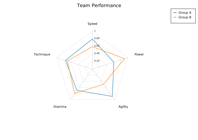
Pass axis names to RadarPlot::new(), then add series with .with_series_labeled(). Colors are assigned from the category10 palette.
#![allow(unused)]
fn main() {
use kuva::plot::radar::RadarPlot;
use kuva::backend::svg::SvgBackend;
use kuva::render::render::render_multiple;
use kuva::render::layout::Layout;
use kuva::render::plots::Plot;

let plot = RadarPlot::new(["Speed", "Power", "Agility", "Stamina", "Technique"])
    .with_series_labeled([0.80, 0.60, 0.90, 0.70, 0.75], "Group A")
    .with_series_labeled([0.60, 0.90, 0.50, 0.80, 0.70], "Group B")
    .with_legend(true);

let plots = vec![Plot::Radar(plot)];
let layout = Layout::auto_from_plots(&plots).with_title("Team Performance");
let svg = SvgBackend.render_scene(&render_multiple(plots, layout));
std::fs::write("radar.svg", svg).unwrap();
}
Filled polygons
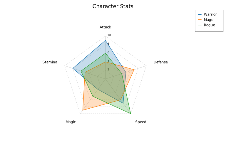
.with_filled(true) shades each series polygon with a semi-transparent fill. Adjust transparency with .with_opacity().
#![allow(unused)]
fn main() {
use kuva::plot::radar::RadarPlot;
use kuva::render::plots::Plot;
use kuva::render::layout::Layout;
use kuva::render::render::render_multiple;
use kuva::backend::svg::SvgBackend;

let plot = RadarPlot::new(["Attack", "Defense", "Speed", "Magic", "Stamina"])
    .with_series_labeled([9.0, 5.0, 7.0, 3.0, 8.0], "Warrior")
    .with_series_labeled([4.0, 7.0, 6.0, 9.0, 5.0], "Mage")
    .with_series_labeled([6.0, 4.0, 10.0, 5.0, 6.0], "Rogue")
    .with_filled(true)
    .with_opacity(0.25)
    .with_range(0.0, 10.0)
    .with_legend(true);

let plots = vec![Plot::Radar(plot)];
let layout = Layout::auto_from_plots(&plots).with_title("Character Stats");
let svg = SvgBackend.render_scene(&render_multiple(plots, layout));
}
Normalised axes
When axes have different units or scales, use .with_normalize(true) to map each axis independently to [0, 1]. Grid ring labels become percentages.
#![allow(unused)]
fn main() {
use kuva::plot::radar::RadarPlot;
use kuva::render::plots::Plot;
use kuva::render::layout::Layout;
use kuva::render::render::render_multiple;

// Axes in different units: km/h, kg, %, %, m
let plot = RadarPlot::new(["Top Speed", "Weight", "Win Rate", "Accuracy", "Jump Height"])
    .with_series_labeled([230.0, 85.0, 0.62, 0.78, 1.20], "Athlete A")
    .with_series_labeled([195.0, 72.0, 0.55, 0.91, 1.45], "Athlete B")
    .with_normalize(true)
    .with_filled(true)
    .with_legend(true);

let plots = vec![Plot::Radar(plot)];
}
Per-axis error bands
Attach ±error values to a series with .with_series_errors(), called immediately after adding the series. A shaded band is drawn between value − error and value + error on each axis.
#![allow(unused)]
fn main() {
use kuva::plot::radar::RadarPlot;
use kuva::render::plots::Plot;
use kuva::render::layout::Layout;
use kuva::render::render::render_multiple;

let plot = RadarPlot::new(["Recall", "Precision", "F1", "AUC", "Speed"])
    .with_series_labeled([0.82, 0.75, 0.78, 0.89, 0.70], "Model A")
    .with_series_errors([0.04, 0.06, 0.05, 0.03, 0.08])
    .with_series_labeled([0.70, 0.88, 0.78, 0.84, 0.90], "Model B")
    .with_series_errors([0.05, 0.04, 0.04, 0.04, 0.06])
    .with_range(0.0, 1.0)
    .with_legend(true);

let plots = vec![Plot::Radar(plot)];
}
Reference overlay
.with_reference() adds a dashed grey polygon — useful for showing a target, average, or population norm that series should be compared against.
#![allow(unused)]
fn main() {
use kuva::plot::radar::RadarPlot;
use kuva::render::plots::Plot;
use kuva::render::layout::Layout;
use kuva::render::render::render_multiple;

let plot = RadarPlot::new(["Endurance", "Strength", "Flexibility", "Balance", "Power"])
    .with_series_labeled([7.0, 8.0, 5.0, 6.0, 9.0], "Athlete")
    .with_reference([6.0, 6.0, 6.0, 6.0, 6.0], "Population avg")
    .with_range(0.0, 10.0)
    .with_filled(true)
    .with_dot_size(4.0)
    .with_legend(true);

let plots = vec![Plot::Radar(plot)];
}
Circular grid
By default grid rings are polygons. Use .with_circular_grid(true) for a more traditional spider-chart appearance.
#![allow(unused)]
fn main() {
use kuva::plot::radar::RadarPlot;
use kuva::render::plots::Plot;
use kuva::render::layout::Layout;
use kuva::render::render::render_multiple;

let plot = RadarPlot::new(["N", "NE", "E", "SE", "S", "SW", "W", "NW"])
    .with_series_labeled([8.0, 3.0, 6.0, 9.0, 5.0, 2.0, 7.0, 4.0], "Signal strength")
    .with_circular_grid(true)
    .with_range(0.0, 10.0)
    .with_filled(true);

let plots = vec![Plot::Radar(plot)];
}
RadarPlot API reference
RadarPlot builders
| Method | Default | Description |
|---|---|---|
RadarPlot::new(axes) | — | Create a plot; axes are names rendered clockwise from top |
.with_series(values) | — | Add an unlabelled series |
.with_series_labeled(values, label) | — | Add a labelled series |
.with_series_color(values, label, color) | — | Add a labelled series with an explicit color |
.with_series_errors(errors) | — | Attach per-axis ±errors to the most recently added series |
.with_series_dasharray(s) | — | Set SVG stroke-dasharray on the most recently added series |
.with_reference(values, label) | — | Add a dashed reference polygon |
.with_reference_color(values, label, color) | — | Add a dashed reference polygon with explicit color |
.with_filled(bool) | false | Fill polygons with a semi-transparent color |
.with_opacity(f) | 0.25 | Fill opacity (used when filled is true) |
.with_range(min, max) | auto | Shared value range for all axes |
.with_axis_range(i, min, max) | — | Override value range for axis i |
.with_normalize(bool) | false | Normalise each axis to [0, 1] independently |
.with_inverted_axis(i) | — | Invert axis i (high values plot near the centre) |
.with_inverted_axes(iter) | — | Invert multiple axes |
.with_grid_lines(n) | 5 | Number of concentric grid rings |
.with_grid(bool) | true | Show grid rings and radial axis lines |
.with_circular_grid(bool) | false | Draw grid rings as circles instead of polygons |
.with_dot_size(px) | — | Draw filled dots at polygon vertices |
.with_stroke_width(px) | 1.5 | Series polygon stroke width |
.with_vertex_labels(bool) | false | Show data value at each polygon vertex |
.with_start_angle(deg) | -90 | Angle of axis 0 in degrees (clockwise from north) |
.with_start_axis(k) | — | Place axis k at the top (north) position |
.with_axis_ticks(bool) | false | Tick marks on each axis at grid ring intersections |
.with_legend(bool) | false | Show a legend box |
See also: Parallel Coordinates for more than a handful of dimensions, Polar Plot for continuous (non-spoke) polar data.
CLI
Render a radar / spider chart from a tabular file. Each row becomes one series polygon; multiple rows can be grouped by a column to compute per-group means.
Input format
Tab- or comma-separated file with one numeric column per axis. Use --axes to select which columns to use.
label	speed	power	agility	stamina	technique
Warrior	8	9	5	8	6
Mage	4	6	6	5	10
Rogue	7	5	10	6	7
Basic examples
# Each row is one polygon; label column for legend entries
kuva radar data.tsv --axes speed power agility stamina technique \
    --label-col label --legend -o radar.svg

# Group rows by a column; polygon = mean per group
kuva radar data.tsv --axes x1 x2 x3 x4 \
    --color-by species --legend -o groups.svg

# Filled polygons with shared scale
kuva radar data.tsv --axes a b c d e \
    --filled --min 0 --max 10 \
    --title "Performance Profile" -o radar_filled.svg

# Normalized axes (each axis scaled to [0,1] independently)
kuva radar data.tsv --axes var1 var2 var3 var4 \
    --normalize --dot-size 4 -o radar_norm.svg
All flags
Data selection
| Flag | Description |
|---|---|
--axes <COLS...> | Axis columns (names or 0-based indices); at least 3 required |
--label-col <COL> | Column of series labels (one label per row) |
--color-by <COL> | Group rows by this column; one polygon per group (mean values) |
Chart style
| Flag | Default | Description |
|---|---|---|
--filled | — | Fill each polygon with a semi-transparent color |
--opacity <F> | 0.25 | Fill opacity (used with --filled) |
--min <F> | 0 | Shared axis minimum value |
--max <F> | data max | Shared axis maximum value |
--grid-lines <N> | 5 | Number of concentric grid rings |
--normalize | — | Normalise each axis independently to [0, 1] |
--dot-size <PX> | — | Draw dots at polygon vertices |
--legend | — | Show a legend |
See also: Shared flags — output, appearance, axes.