Pareto Chart
A Pareto chart is a bar chart of category values, sorted descending by default, with a cumulative-percentage line superimposed on a secondary axis (fixed 0-100%). The classic "80/20 rule" chart — a dashed reference line at 80% by default, labeled with its percentage, highlights how many categories account for the bulk of the total. Common in QC, variant analysis, and error-categorisation work.
Import path: kuva::plot::ParetoPlot
Basic usage
Add categories with .with_categories(). Categories are automatically sorted descending by value before rendering (disable with .with_sorted(false) to preserve insertion order). A legend showing "Value" / "Cumulative %" appears by default, since the bars and the line are two encodings that always coexist — pass custom labels via .with_legend(), or hide it with .with_show_legend(false).
#![allow(unused)]
fn main() {
use kuva::plot::ParetoPlot;
use kuva::backend::svg::SvgBackend;
use kuva::render::render::render_multiple;
use kuva::render::layout::Layout;
use kuva::render::plots::Plot;

let pareto = ParetoPlot::new().with_categories(vec![
    ("Missing field", 42.0),
    ("Typo", 31.0),
    ("Timeout", 18.0),
    ("Bad format", 12.0),
    ("Duplicate entry", 9.0),
    ("Other", 6.0),
]);

let plots = vec![Plot::Pareto(pareto)];
let layout = Layout::auto_from_plots(&plots)
    .with_title("Support Ticket Error Categories")
    .with_y_label("Count");

let svg = SvgBackend.render_scene(&render_multiple(plots, layout));
std::fs::write("pareto.svg", svg).unwrap();
}
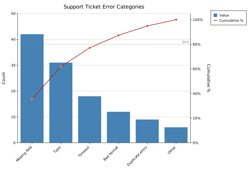
The secondary axis (cumulative %) is always fixed at 0-100% — it's a percentage by construction, not data-driven, so there's nothing to configure — and its ticks are formatted as 0%, 20%, …, 100% rather than bare numbers. The categorical axis defaults to rotated (-45°), collision-thinned labels, since Pareto data often has more categories than a typical hand-built bar chart.
Styling
#![allow(unused)]
fn main() {
use kuva::plot::ParetoPlot;
let pareto = ParetoPlot::new()
    .with_categories(vec![("Missing field", 42.0), ("Typo", 31.0), ("Other", 6.0)])
    .with_color("seagreen")
    .with_line_color("darkorange")
    .with_threshold(90.0)
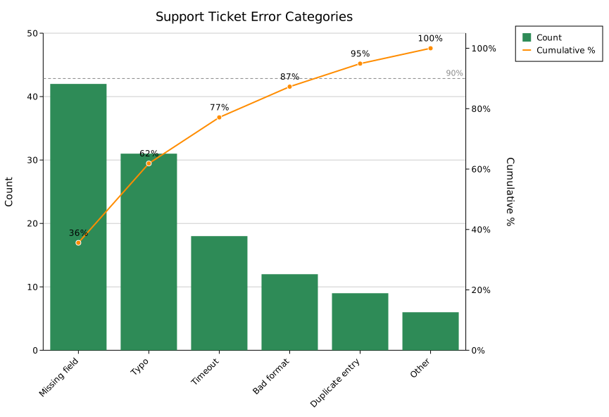
    .with_cumulative_labels(true)
    .with_legend("Count", "Cumulative %");
}
Collapsing a long tail into "Other"
Real-world Pareto data (defect logs, error taxonomies) often has a long tail of small categories after the top few, cluttering the axis. .with_max_categories(n) collapses everything beyond the top n - 1 into one bar — but instead of silently summing the tail into an opaque total, that bar renders as a stack of its constituent categories, each decoded via its own legend entry, so nothing is hidden.
#![allow(unused)]
fn main() {
use kuva::plot::ParetoPlot;
let pareto = ParetoPlot::new()
    .with_categories(vec![
        ("Missing field", 42.0), ("Typo", 31.0), ("Timeout", 18.0), ("Bad format", 12.0),
        ("Duplicate entry", 9.0), ("Wrong encoding", 7.0), ("Network blip", 5.0), ("Other misc", 3.0),
    ])
    .with_max_categories(5); // keeps the top 4 + one "Other" bar for the rest
}
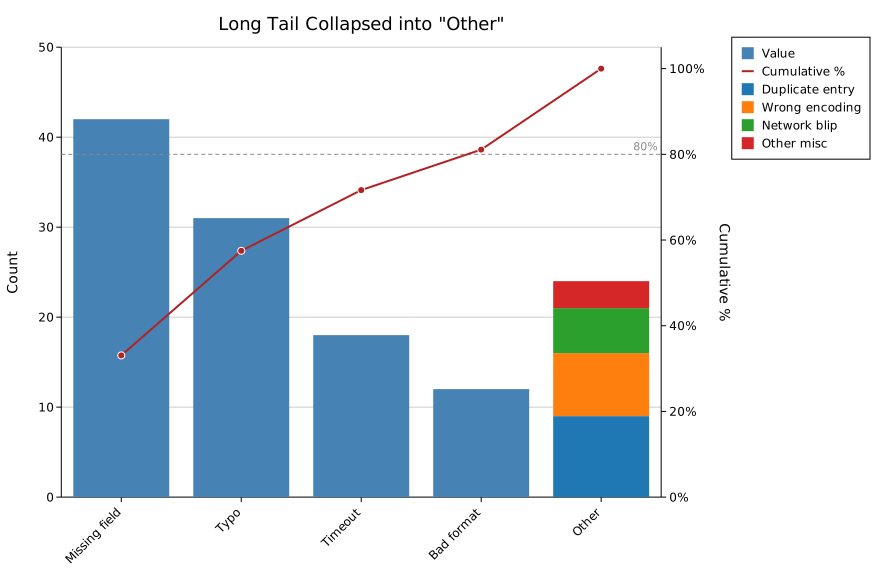
The bucket contributes exactly one point to the cumulative line, matching its one slot on the axis. Use .with_other_label(str) to rename the bucket (default "Other").
Horizontal mode
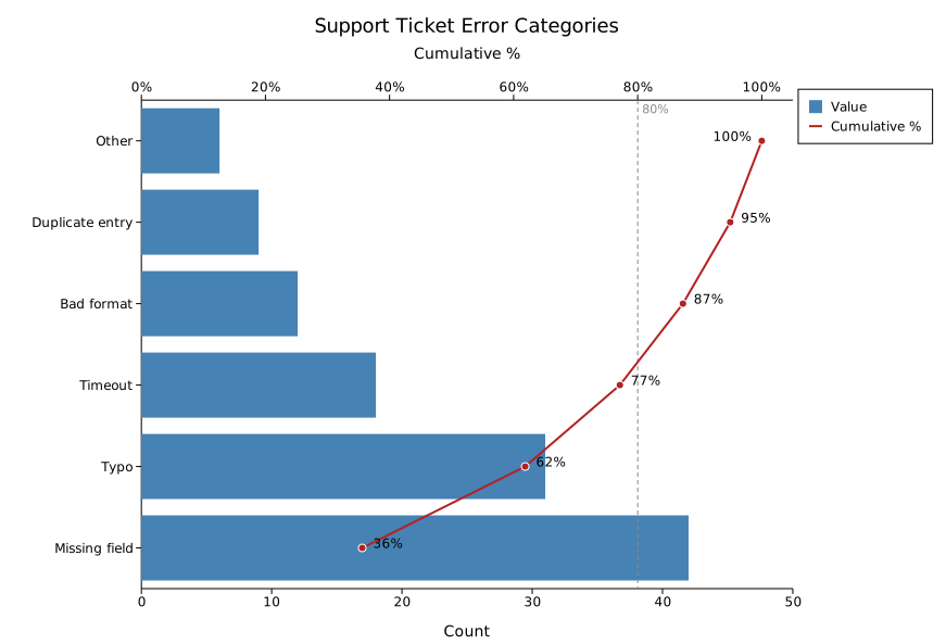
.with_horizontal(true) puts categories on the Y-axis and values on the X-axis — useful when category names are long. The cumulative-% line moves to a secondary X-axis drawn on top of the plot (rather than the secondary Y-axis on the right), since the secondary axis always pairs with whichever axis carries values.
#![allow(unused)]
fn main() {
use kuva::plot::ParetoPlot;
let pareto = ParetoPlot::new()
    .with_categories(vec![("Missing field", 42.0), ("Typo", 31.0), ("Other", 6.0)])
    .with_horizontal(true)
    .with_cumulative_labels(true);
}
Builder reference
| Method | Default | Description |
|---|---|---|
.with_category(label, value) | — | Add a single category |
.with_categories(iter) | — | Add multiple (label, value) pairs |
.with_color(css) | "steelblue" | Bar fill color |
.with_line_color(css) | "firebrick" | Cumulative-line color |
.with_width(frac) | 0.8 | Bar width as a fraction of the category slot |
.with_sorted(bool) | true | Sort descending by value; false preserves insertion order |
.with_cumulative_labels(bool) | false | Show a % label above (or beside, in horizontal mode) each cumulative-line point |
.with_threshold(pct) | 80.0 | Reference-line value; implies .with_show_threshold(true) |
.with_show_threshold(bool) | true | Toggle the dashed reference line |
.with_legend(bar_label, line_label) | "Value", "Cumulative %" | Legend labels for the bars and the cumulative line |
.with_show_legend(bool) | true | Toggle the legend |
.with_max_categories(n) | — (no bucketing) | Collapse categories beyond the top n - 1 into one stacked "Other" bar |
.with_other_label(str) | "Other" | Label for the bucketed bar |
.with_horizontal(bool) | false | Categories on Y, values on X; cumulative line on a secondary X-axis |
See also: Bar Chart for plain (non-cumulative) categorical bars, Funnel Chart for a different stage-drop-off visualization.
CLI
Input: one row per category with a label column and a value column.
| Flag | Default | Description |
|---|---|---|
--label-col <COL> | 0 | Category label column |
--value-col <COL> | 1 | Category value column |
--color <CSS> | steelblue | Bar fill color |
--line-color <CSS> | firebrick | Cumulative-line color |
--bar-width <FRAC> | 0.8 | Bar width as a fraction of the category slot |
--no-sort | off | Preserve input row order instead of sorting descending by value |
--threshold <PCT> | 80.0 | Reference-line value (cumulative %) |
--no-threshold | off | Hide the dashed reference line |
--cumulative-labels | off | Show a % label above (or beside, in --horizontal mode) each cumulative-line point |
--legend <BAR,LINE> | Value,Cumulative % | Legend labels for the bars and the cumulative line, comma-separated |
--no-legend | off | Hide the legend (shown by default) |
--max-categories <N> | — (no bucketing) | Collapse categories beyond the top N - 1 into one stacked "Other" bar |
--other-label <STR> | Other | Label for the bucketed bar; no effect without --max-categories |
--horizontal | off | Categories on Y-axis, values on X-axis; cumulative line on a secondary X-axis drawn on top |
kuva pareto data.tsv --label-col category --value-col count

kuva pareto data.tsv --label-col category --value-col count \
    --color seagreen --line-color darkorange --threshold 90 \
    --cumulative-labels --legend "Count,Cumulative %"

kuva pareto data.tsv --label-col category --value-col count \
    --horizontal --max-categories 5 --other-label "Misc"
See also: Shared flags — output, appearance, axes.