Showcase
The Gallery is one card per plot type. This page is the opposite: a few elaborate compositions that show what kuva looks like pushed further, not a catalog. Full source for everything below lives in examples/showcase.rs (SVGs) and docs/tapes/ (terminal recordings).
Two-source wave interference
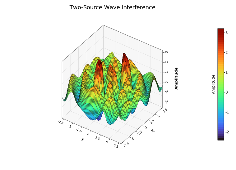
One plot, pushed hard: no multi-panel layout, no dashboard framing, just a single 3D Surface Plot evaluated over a 70x70 grid from two interfering ripple sources, like two stones dropped in a pond. Surface3DPlot::with_data_fn builds the grid directly from a closure, so the whole shape is one function.
#![allow(unused)]
fn main() {
use kuva::backend::svg::SvgBackend;
use kuva::plot::surface3d::Surface3DPlot;
use kuva::plot::ColorMap;
use kuva::render::layout::Layout;
use kuva::render::plots::Plot;
use kuva::render::render::render_multiple;

let source_a = (-3.2, -1.5);
let source_b = (2.6, 2.0);

let z_fn = |x: f64, y: f64| {
    let r_a = ((x - source_a.0).powi(2) + (y - source_a.1).powi(2)).sqrt();
    let r_b = ((x - source_b.0).powi(2) + (y - source_b.1).powi(2)).sqrt();
    let ripple_a = (r_a * 2.2).sin() / (r_a * 0.6 + 1.0);
    let ripple_b = (r_b * 2.2).sin() / (r_b * 0.6 + 1.0);
    3.5 * (ripple_a + ripple_b)
};

let surface = Surface3DPlot::new(vec![])
    .with_data_fn(z_fn, -8.0..=8.0, -8.0..=8.0, 70, 70)
    .with_z_colormap(ColorMap::Turbo)
    .with_wireframe_color("#00000030")
    .with_wireframe_width(0.3)
    .with_azimuth(-55.0)
    .with_elevation(38.0)
    .with_x_label("X")
    .with_y_label("Y")
    .with_z_label("Amplitude");

let plots = vec![Plot::Surface3D(surface)];
let layout = Layout::auto_from_plots(&plots).with_title("Two-Source Wave Interference");
let svg = SvgBackend.render_scene(&render_multiple(plots, layout));
std::fs::write("interference.svg", svg).unwrap();
}
Multi-panel dashboard
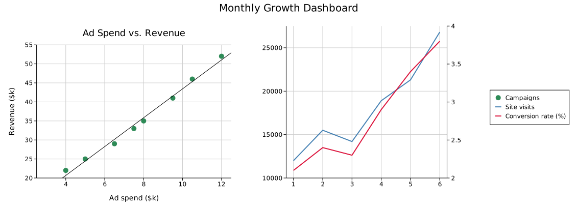
A Figure with a twin-Y panel (two independent y-axes sharing one x-axis) next to a plain scatter panel with a fitted trend line, all sharing one legend on the right.
#![allow(unused)]
fn main() {
use kuva::backend::svg::SvgBackend;
use kuva::plot::scatter::TrendLine;
use kuva::plot::{LinePlot, ScatterPlot};
use kuva::render::figure::Figure;
use kuva::render::layout::Layout;
use kuva::render::plots::Plot;

let visits = vec![(1.0, 12_000.0), (2.0, 15_500.0), (3.0, 14_200.0), (4.0, 18_900.0)];
let conversion = vec![(1.0, 2.1), (2.0, 2.4), (3.0, 2.3), (4.0, 2.9)];

let primary = vec![Plot::Line(LinePlot::new().with_data(visits).with_color("steelblue").with_legend("Site visits"))];
let secondary = vec![Plot::Line(LinePlot::new().with_data(conversion).with_color("crimson").with_legend("Conversion rate (%)"))];

let spend_revenue = vec![(4.0, 22.0), (6.5, 29.0), (8.0, 35.0), (12.0, 52.0)];
let scatter_panel = vec![Plot::Scatter(
    ScatterPlot::new()
        .with_data(spend_revenue)
        .with_color("seagreen")
        .with_legend("Campaigns")
        .with_trend(TrendLine::Linear),
)];

// `with_layouts` matches cells positionally by index, so the twin-Y cell
// (which has no entry here) must come *after* every cell that does: it
// falls through to `Layout::auto_from_twin_y_plots` automatically.
let layouts = vec![Layout::auto_from_plots(&scatter_panel).with_title("Ad Spend vs. Revenue")];

let scene = Figure::new(1, 2)
    .with_title("Monthly Growth Dashboard")
    .with_plots(vec![scatter_panel, vec![]])
    .with_twin_y_plots(1, primary, secondary)
    .with_layouts(layouts)
    .with_shared_legend()
    .render();

std::fs::write("dashboard.svg", SvgBackend.render_scene(&scene)).unwrap();
}
Genomics dashboard
Leaning into kuva's bioinformatics niche: a GWAS Manhattan plot, a gene-expression Clustermap, and a Phylogenetic Tree, composed in one Figure.
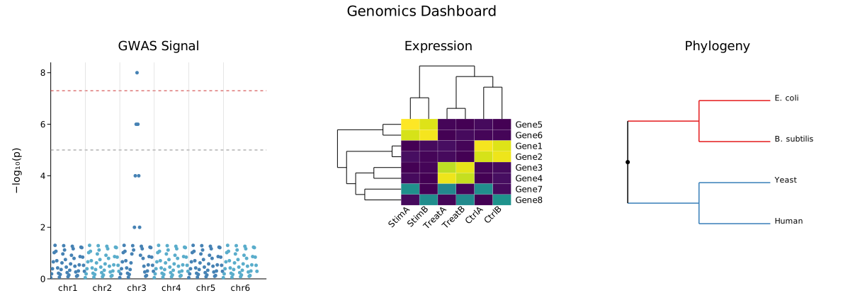
Notice the Manhattan panel has full axes and tick labels, while the Clustermap and Phylogeny panels don't: both are pixel-space plot types (their own dendrograms/branch layouts stand in for axes), so this mix of "with axes" and "without" is what combining different plot personalities in one Figure actually looks like, not a rendering bug.
#![allow(unused)]
fn main() {
use kuva::backend::svg::SvgBackend;
use kuva::plot::{Clustermap, ColorMap, ManhattanPlot, PhyloTree};
use kuva::render::figure::Figure;
use kuva::render::layout::Layout;
use kuva::render::plots::Plot;

// `with_data` takes *raw* p-values (0..1) and computes -log10(p) itself.
let gwas: Vec<(String, f64)> = vec![
    ("chr1".into(), 0.42), ("chr1".into(), 0.08),
    ("chr3".into(), 3e-8), ("chr3".into(), 0.31),
];
let manhattan = vec![Plot::Manhattan(ManhattanPlot::new().with_data(gwas))];

let expr = vec![
    vec![8.2, 7.9, 0.4, 0.2, 0.1, 0.3],
    vec![0.2, 0.3, 7.5, 8.0, 0.1, 0.2],
];
let clustermap = vec![Plot::Clustermap(
    Clustermap::new()
        .with_data(expr)
        .with_row_labels(["Gene1", "Gene3"])
        .with_col_labels(["CtrlA", "CtrlB", "TreatA", "TreatB", "StimA", "StimB"])
        .with_color_map(ColorMap::Viridis),
)];

let edges: Vec<(&str, &str, f64)> = vec![
    ("root", "Bacteria", 1.5),
    ("root", "Eukarya", 2.0),
    ("Bacteria", "E. coli", 0.5),
    ("Eukarya", "Human", 0.8),
];
let phylo = vec![Plot::PhyloTree(PhyloTree::from_edges(&edges))];

let layouts = vec![
    Layout::auto_from_plots(&manhattan).with_title("GWAS Signal").with_y_label("−log₁₀(p)"),
    Layout::auto_from_plots(&clustermap).with_title("Expression"),
    Layout::auto_from_plots(&phylo).with_title("Phylogeny"),
];

let scene = Figure::new(1, 3)
    .with_title("Genomics Dashboard")
    .with_plots(vec![manhattan, clustermap, phylo])
    .with_layouts(layouts)
    .render();

std::fs::write("genomics_dashboard.svg", SvgBackend.render_scene(&scene)).unwrap();
}
The Iris dataset
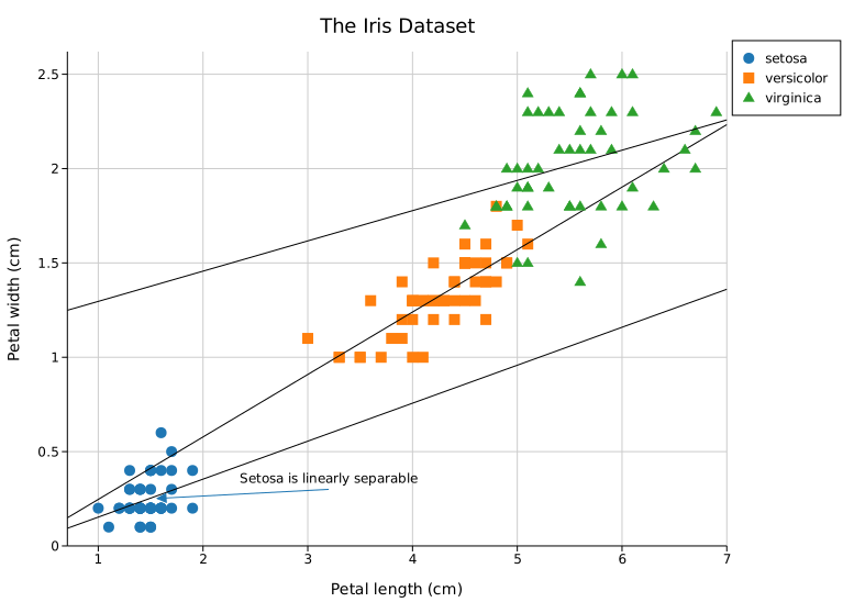
The real Fisher/Anderson iris dataset: 150 flowers, three species, petal length vs. petal width. One marker shape and fitted trend line per species. Setosa's famous linear separability from the other two species gets an arrowed TextAnnotation.
#![allow(unused)]
fn main() {
use kuva::backend::svg::SvgBackend;
use kuva::plot::scatter::TrendLine;
use kuva::plot::{MarkerShape, ScatterPlot};
use kuva::render::annotations::TextAnnotation;
use kuva::render::layout::Layout;
use kuva::render::plots::Plot;
use kuva::render::render::render_multiple;

// (petal_length, petal_width): real data, a handful of rows per species
let setosa = vec![(1.4, 0.2), (1.4, 0.2), (1.3, 0.2), (1.5, 0.2)];
let versicolor = vec![(4.7, 1.4), (4.5, 1.5), (4.9, 1.5), (4.0, 1.3)];
let virginica = vec![(6.0, 2.5), (5.1, 1.9), (5.9, 2.1), (5.6, 1.8)];

let species: [(&str, MarkerShape, &str, Vec<(f64, f64)>); 3] = [
    ("setosa", MarkerShape::Circle, "#1f77b4", setosa),
    ("versicolor", MarkerShape::Square, "#ff7f0e", versicolor),
    ("virginica", MarkerShape::Triangle, "#2ca02c", virginica),
];

let plots: Vec<Plot> = species
    .into_iter()
    .map(|(label, marker, color, data)| {
        Plot::Scatter(
            ScatterPlot::new()
                .with_data(data)
                .with_color(color)
                .with_marker(marker)
                .with_legend(label)
                .with_trend(TrendLine::Linear),
        )
    })
    .collect();

let layout = Layout::auto_from_plots(&plots)
    .with_title("The Iris Dataset")
    .with_annotation(
        TextAnnotation::new("Setosa is linearly separable", 3.2, 0.3).with_arrow(1.5, 0.25),
    );

std::fs::write("iris.svg", SvgBackend.render_scene(&render_multiple(plots, layout))).unwrap();
}
Global temperature anomaly
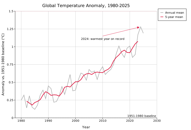
Real NASA GISS annual global temperature anomaly data, 1980 to 2025, against the 1951-1980 baseline. A raw annual LinePlot plus a computed 5-year rolling mean, the same annual-plus-smoothed presentation NASA's own public charts use for this series. Two reference lines (the baseline and the Paris Agreement's 1.5°C threshold) and an annotation on the warmest year on record.
#![allow(unused)]
fn main() {
use kuva::backend::svg::SvgBackend;
use kuva::plot::LinePlot;
use kuva::render::annotations::{ReferenceLine, TextAnnotation};
use kuva::render::layout::Layout;
use kuva::render::plots::Plot;
use kuva::render::render::render_multiple;

// Real data, data.giss.nasa.gov/gistemp, GLB.Ts+dSST.csv, J-D column
let annual: Vec<(i32, f64)> = vec![
    (2021, 0.85), (2022, 0.89), (2023, 1.17), (2024, 1.28), (2025, 1.19),
];

let annual_line = Plot::Line(
    LinePlot::new()
        .with_data(annual.iter().map(|&(y, v)| (y as f64, v)))
        .with_color("#aaaaaa")
        .with_legend("Annual mean"),
);

// 5-year centered rolling mean
let smoothed: Vec<(f64, f64)> = annual
    .windows(5)
    .map(|w| (w[2].0 as f64, w.iter().map(|&(_, v)| v).sum::<f64>() / 5.0))
    .collect();
let smoothed_line = Plot::Line(
    LinePlot::new()
        .with_data(smoothed)
        .with_color("crimson")
        .with_stroke_width(2.5)
        .with_legend("5-year mean"),
);

let plots = vec![annual_line, smoothed_line];
let layout = Layout::auto_from_plots(&plots)
    .with_title("Global Temperature Anomaly, 1980-2025")
    .with_reference_line(ReferenceLine::horizontal(0.0).with_label("1951-1980 baseline"))
    .with_reference_line(
        ReferenceLine::horizontal(1.5).with_color("crimson").with_label("Paris Agreement 1.5°C"),
    )
    .with_annotation(
        TextAnnotation::new("2024: warmest year on record", 2010.0, 1.15)
            .with_arrow(2024.0, 1.28)
            .with_color("crimson"),
    );

std::fs::write("temperature.svg", SvgBackend.render_scene(&render_multiple(plots, layout))).unwrap();
}
Airway smooth muscle: dexamethasone response
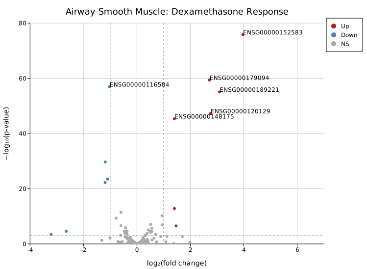
A Volcano Plot built entirely from real DESeq2 output for the classic Himes et al. 2014 airway RNA-seq experiment (dexamethasone-treated airway smooth muscle cells): around 230 genes taken directly, in their original file order, from a published results table, plus the 6 most significant genes overall from a separate real run of the same dataset. No synthetic filler; the non-significant cloud and the graded tail of increasingly significant genes leading up to the extreme hits are both real, which is what actually gives it a volcano shape instead of two disconnected clusters. Significance coloring and the dashed fold-change/p-value threshold lines are automatic, and .with_label_top(6) picks out the 6 real most-significant genes and labels them by their Ensembl gene ID.
#![allow(unused)]
fn main() {
use kuva::backend::svg::SvgBackend;
use kuva::plot::VolcanoPlot;
use kuva::render::layout::Layout;
use kuva::render::plots::Plot;
use kuva::render::render::render_multiple;

// Real DESeq2 output for the airway dataset (Himes et al. 2014): a broad,
// unsorted sample plus the most significant genes overall
let points = vec![
    ("ENSG00000000003".to_string(), 0.381, 1.52e-4),
    ("ENSG00000003402".to_string(), -1.190, 5.66e-23),
    ("ENSG00000152583".to_string(), 3.966942, 1.541835e-76),
    ("ENSG00000116584".to_string(), -1.026994, 1.160615e-57),
];

let volcano = VolcanoPlot::new()
    .with_points(points)
    .with_fc_cutoff(1.0)
    .with_p_cutoff(0.001)
    .with_label_top(6);

let plots = vec![Plot::Volcano(volcano)];
let layout = Layout::auto_from_plots(&plots).with_title("Airway Smooth Muscle: Dexamethasone Response");

std::fs::write("volcano.svg", SvgBackend.render_scene(&render_multiple(plots, layout))).unwrap();
}
Breast cancer diagnosis: feature discriminative power
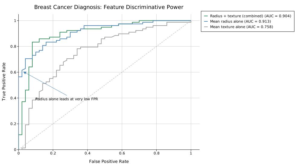
Three naive "classifiers" compared on one ROC axes, built from real diagnostic measurements in the UCI Breast Cancer Wisconsin (Diagnostic) dataset: mean radius alone, mean texture alone, and a simple combined z-score of both. RocGroup::with_raw takes raw (score, is_malignant) pairs and computes AUC (with the diagonal reference line) automatically per group; no manual curve-fitting or AUC math required.
The real result is genuinely counterintuitive, and worth spelling out rather than just reading off the legend: the two curves actually cross. In the middle of the false-positive-rate range the combined score has a higher true-positive rate than radius alone, which is the more visually obvious "knee" in the chart. But right at the very start, from FPR 0 up to about 0.05, radius alone has a much larger lead (TPR 0.56–0.70 for radius alone vs. 0.11–0.46 for the combined score at those same false-positive rates). AUC integrates the entire curve, not just the region a viewer's eye is drawn to, and radius's dominant early lead outweighs the combined score's smaller mid-range advantage once the whole curve is summed. That's why radius alone still wins on total AUC (0.913 vs. 0.904) despite not having the more dramatic knee.
#![allow(unused)]
fn main() {
use kuva::backend::svg::SvgBackend;
use kuva::plot::{RocGroup, RocPlot};
use kuva::render::annotations::TextAnnotation;
use kuva::render::layout::Layout;
use kuva::render::plots::Plot;
use kuva::render::render::render_multiple;

// (is_malignant, radius_mean, texture_mean): real data, UCI Breast Cancer
// Wisconsin (Diagnostic) dataset
let samples: Vec<(bool, f64, f64)> = vec![
    (true, 17.99, 10.38), (true, 20.57, 17.77), (false, 13.54, 14.36), (false, 13.08, 15.71),
];

let radius = RocGroup::new("Mean radius alone")
    .with_raw(samples.iter().map(|&(m, r, _)| (r, m)))
    .with_color("steelblue");
let texture = RocGroup::new("Mean texture alone")
    .with_raw(samples.iter().map(|&(m, _, t)| (t, m)))
    .with_color("#999999");

let roc = RocPlot::new().with_groups([radius, texture]).with_legend("Naive classifiers");

let plots = vec![Plot::Roc(roc)];
let layout = Layout::auto_from_plots(&plots)
    .with_title("Breast Cancer Diagnosis: Feature Discriminative Power")
    .with_annotation(
        TextAnnotation::new("Radius alone leads at very low FPR", 0.28, 0.42)
            .with_arrow(0.02, 0.61)
            .with_color("steelblue"),
    );

std::fs::write("roc.svg", SvgBackend.render_scene(&render_multiple(plots, layout))).unwrap();
}
E-commerce's share of US retail sales
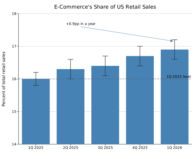
A Bar Chart with symmetric error bars from the real reported standard error, real Census Bureau quarterly e-commerce share of total US retail sales, and a reference line at the year-ago level. The y-axis starts at 14%, not zero, so the real quarter-over-quarter rise (a genuine but small change relative to a 0-100% scale) is actually visible; a bar chart zoomed in like this is worth saying so plainly rather than leaving it for the reader to notice.
#![allow(unused)]
fn main() {
use kuva::backend::svg::SvgBackend;
use kuva::plot::BarPlot;
use kuva::render::annotations::{ReferenceLine, TextAnnotation};
use kuva::render::layout::Layout;
use kuva::render::plots::Plot;
use kuva::render::render::render_multiple;

// Real data, Census Bureau Quarterly Retail E-Commerce Sales, 1st Quarter 2026 report
let quarters = [("1Q 2025", 16.0), ("2Q 2025", 16.3), ("3Q 2025", 16.4), ("4Q 2025", 16.7), ("1Q 2026", 16.9)];
let errors = vec![0.2, 0.3, 0.3, 0.3, 0.3]; // real reported standard error

let bar = BarPlot::new().with_bars(quarters.to_vec()).with_color("steelblue").with_error(errors);

let plots = vec![Plot::Bar(bar)];
let layout = Layout::auto_from_plots(&plots)
    .with_title("E-Commerce's Share of US Retail Sales")
    .with_y_axis_min(14.0)
    .with_reference_line(ReferenceLine::horizontal(16.0).with_label("1Q 2025 level"))
    .with_annotation(TextAnnotation::new("+0.9pp in a year", 2.3, 17.6).with_arrow(5.0, 17.15));

std::fs::write("ecommerce.svg", SvgBackend.render_scene(&render_multiple(plots, layout))).unwrap();
}
Terminal rendering
Every plot above also renders directly in a terminal, via braille-grid graphics and ANSI color: no SVG, no browser needed. --terminal is supported on 20+ subcommands (see CLI: Terminal Output for the full list); a couple of the more visually striking ones, tying back into the genomics theme above:


These are generated with VHS from tape scripts in docs/tapes/; see CONTRIBUTING.md § "Setting up VHS" if you want to record a new one.
Every composition on this page is plain library code: build the Plot/Figure/Layout values, call .render(), write the SVG. That's also the shape of the CLI's --emit-code flag: build a plot from the command line, then get back the exact Rust source that reproduces it. The next step, sketched in issue #84 and not yet started, is a WASM-compiled composer in the browser, so this page's "paste the code, see the plot" loop works without a local Rust toolchain at all.